A practical guide
Blog Cover Image Size: Start with Your Actual Layout
A blog cover can appear at the top of an article, in a card and in a social preview. Those placements may use different crops, so there is no single image dimension that fits every blog.
Explore the examples ↓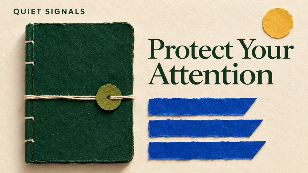
Measure the space you control
Check the width and shape of the image area in your publishing theme. A wide editorial header may work at 16:9, while an article card may crop it to a different ratio. Treat any suggested dimensions as a starting point and verify your own theme.
Keep the essential content inside a safe center
Place the subject and any headline away from the extreme edges. Make a separate crop when the card preview cuts off important information. A decorative texture can tolerate cropping more easily than a title or face.
Let the article title do its job
If the page already places a large HTML title above the image, a picture without repeated headline text may be clearer. The Quiet Signals example includes words because it is designed as a standalone header; that choice can change with your layout.
Use a real image element and useful alternative text
Google recommends standard image elements with a usable src URL so images can be discovered. Describe the image's actual subject in its alternative text and place it near relevant text. Avoid using a CSS background for an image you want indexed.
Source: Google Search Central · checked November 6, 2026
Check the page after upload
Review the article on desktop and mobile, plus the card or social preview if your platform provides one. Inspect clarity, crop and file weight together. A smaller web file can make the page easier to load while you keep the original master separately.
See the idea take shape
Explore the image. Open the prompt. Change the details that make it yours.
Quiet Signals newsletter header
Original AI-generated example.
See the exact prompt
Create a finished 16:9 landscape editorial newsletter header for the fictional publication QUIET SIGNALS. A bold, intelligent handmade paper composition about protecting attention: a large dark emerald notebook occupies the left center, while the right side has three crisp cobalt paper tabs and a small circle of warm sunlight. The design is graphic and tactile, viewed directly from above, calm cream background with plenty of negative space. Elegant dark green serif headline in two lines, exact wording 'Protect Your Attention'. Small publication name 'QUIET SIGNALS' in a restrained sans serif at top left. One clear visual idea, controlled olive, cream and cobalt palette. Beautiful independent magazine design with genuinely readable typography. No other words, no dates, no gradients, no logos, no watermark, no border, no mockup around the final artwork.
A few useful answers
Is 1200 pixels always the right width?
No. The useful width depends on your theme, display size and publishing platform.
Should the cover repeat my article title?
Only when it helps the placement. A standalone share image and an on-page illustration can need different text treatments.
Keep exploring
All ideas ↗Newsletter Headers & Blog Cover Image Prompts
Set the tone before the first paragraph.
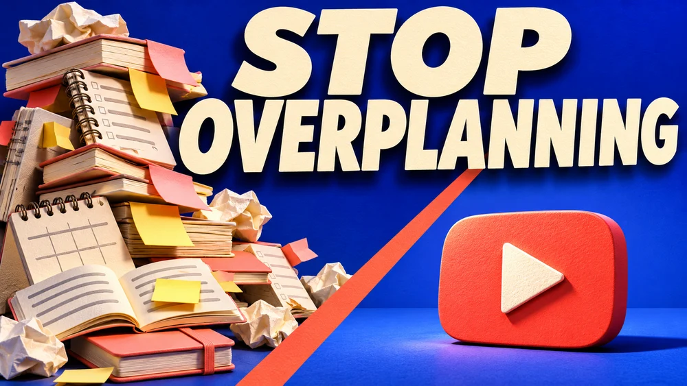
YouTube Thumbnail Size: Shape, Pixels and Upload Limits
YouTube Thumbnail Size & Readability Guide
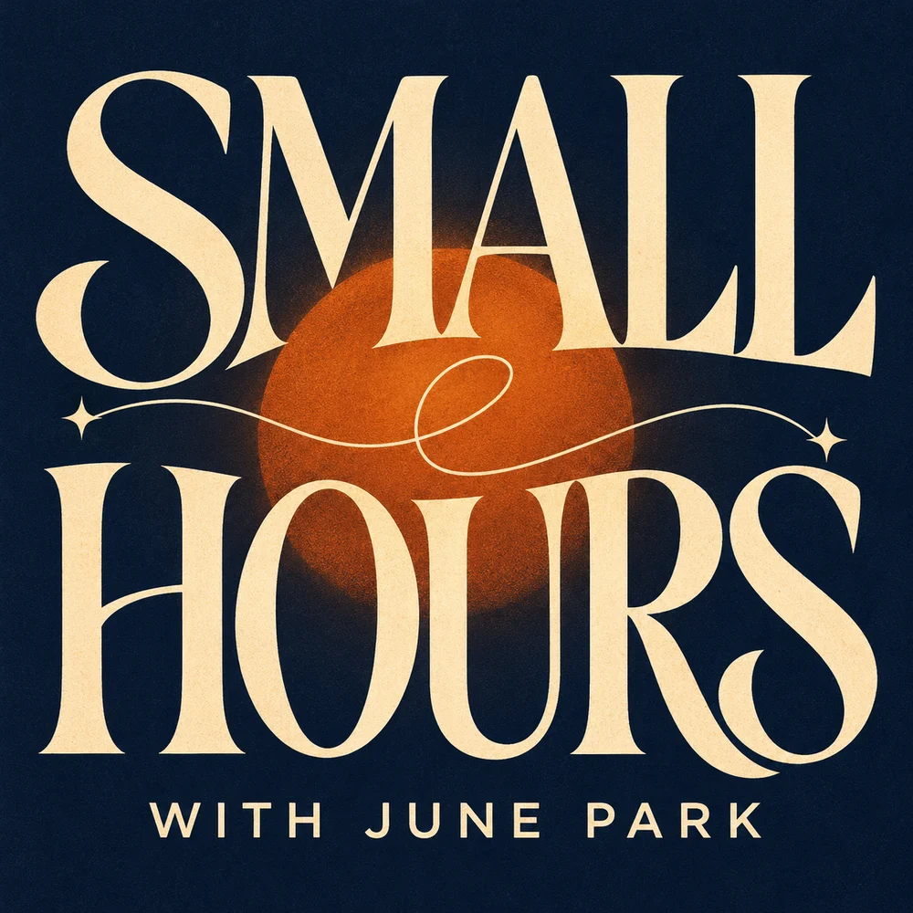
Podcast Cover Art Size: A Practical Apple Podcasts Checklist
Podcast Cover Art Size: Requirements & Checks
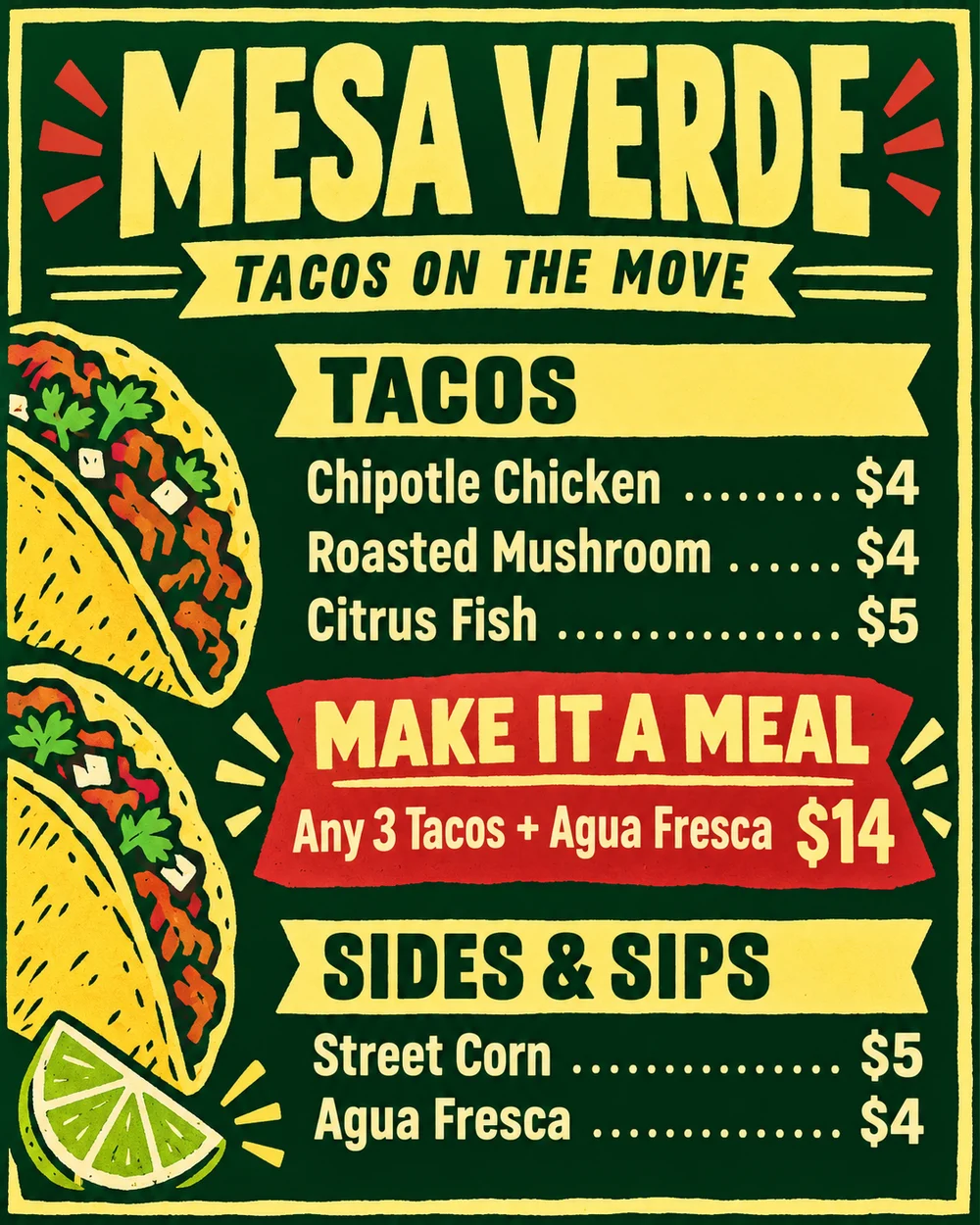
Food Truck Menu Ideas That Help People Order
Food Truck Menu Ideas: A Clear, Readable Board